Role
MHCI Student
Credits
Julian Scaff (ArtCenter Chair)
Elise Co (Co-founder @Aeolab)
Miller Klitsner (Professor)
Timeline
Jun 5 - Aug 20, 2024
This was a graduate thesis project for my Capstone project at ArtCenter College of Design for my Masters in Human Computer Interaction (MHCI).
This is not the full case study. For the full case study I would be happy to chat!
I designed and ideated every element, flow, prototype, and feature of Candor.
The primary goal was to design an intuitive browser that would aid users in combating echo chambers, filter bubbles, and confirmation bias while browsing generative content on the web. The emphasis was on merging functionality with user-friendliness, ensuring every feature was beneficial and straightforward to use. By diversifying information sources, offering contextual prompts, and promoting cross-community interactions, the Candors assistant encourages users to engage with a broader range of perspectives, helping to create a more balanced and open browsing experience.
• How might we rethink the environment built on top of a web browser?
• How might we create a browsing experience that is more collaborative?
• How might we re-envision the browser as an extension of an LLM?
• How might we design a web browser that accommodates for filter bubbles, echo chambers, and confirmation bias?
• How might we design a web browser that allows for seamless collaboration through shared access?
• How might we educate users in regards to using a different type of browser?
Understanding that Candor would inherently be a new way to browse the web, an onboarding experience that walked the user through how to use its pivotal features was necessary.
The goal was to guide users through its unique features with engaging videos, ensuring clarity and highlighting what sets Candor apart.


I created a '⭐️ Get started' tutorial that would be triggered upon a user arriving to the empty state of Candor. If the user dismisses the onboarding experience they can always come back to the '⭐️ Get started' tab and watch again.
Each modal serves as a further explanation into the feature. They also serve to give the user a glimpse into what the feature is about and allow them to explore further but no overwhelm them with feature overload right off the bat.
All in all, the onboarding was successful throughout user testing process. Users immediately understood the main features that Candor had to offer and loved that they could dive deeper if they wanted or just get to it and start browsing and come back later.
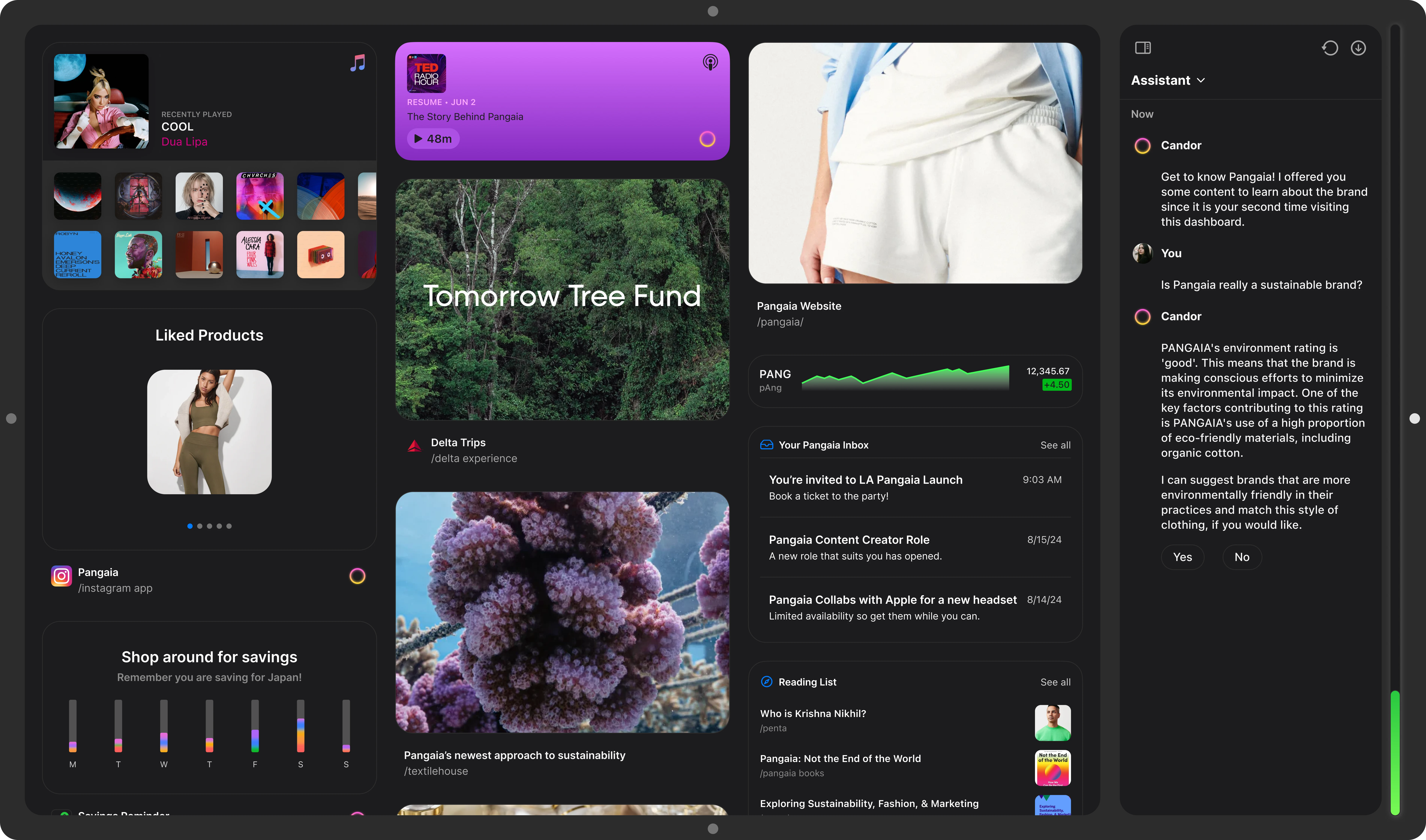
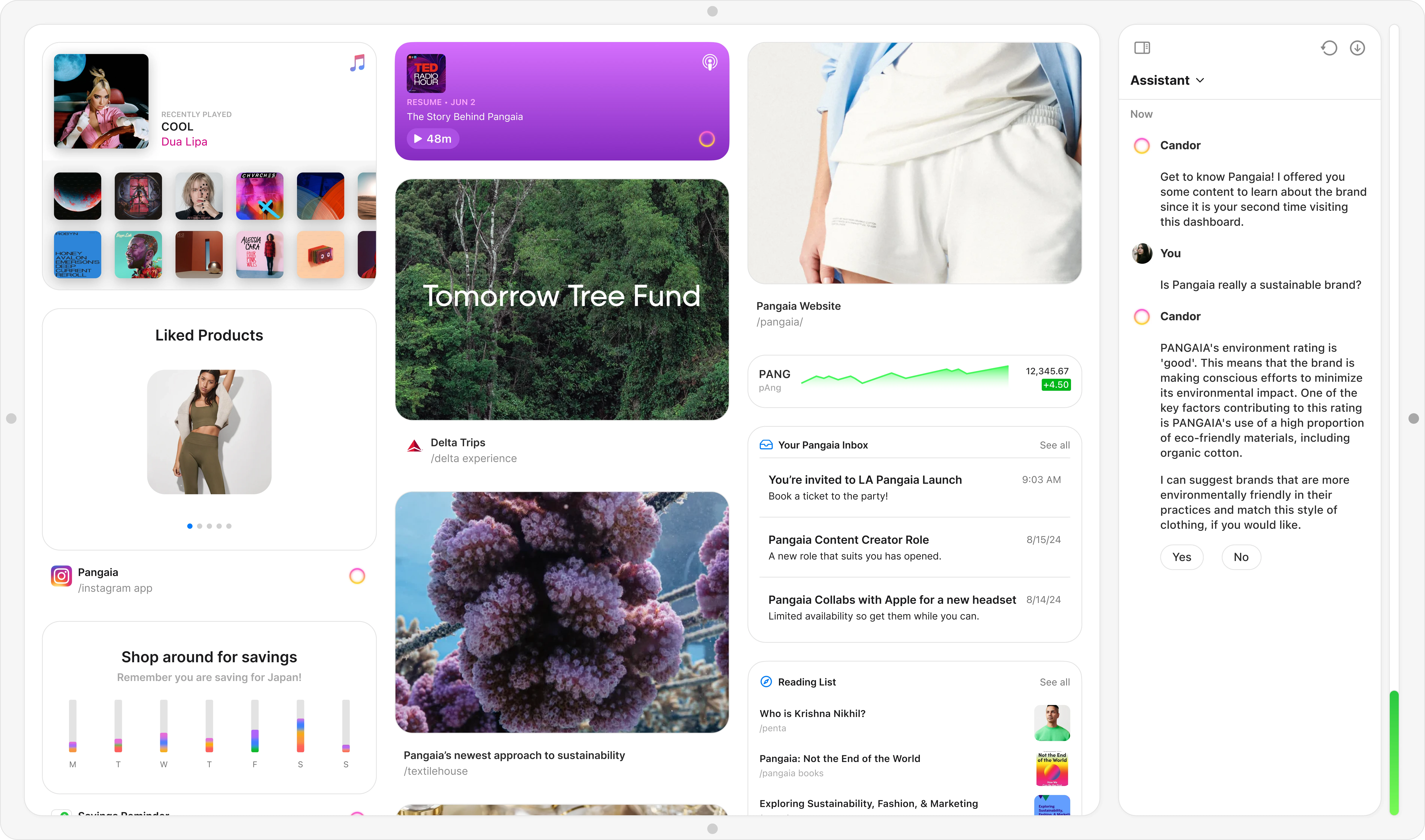
I enhanced personalization by introducing customizable widgets for users’ favorite websites. Each website would have its own specific dashboard in which a user could curate on their own. Users can discover social events, music supported by the brand, brand-specific emails, suggested readings, and more through integrated widgets such as Instagram, Stocks, Reading List, and Apple Music, creating a dynamic and tailored experience.
The goal was to have content rich experiences in which the user chose for themselves to be at the forefront. Users could add, remove, and place the widgets however they like within the dashboard to get even more catered feel to their dashboard.


Users can easily peruse the widgets panel and find widgets that each site supports and apply a widget to every favorited site, or specific sites. Obviously each site would control what their widget looked and functioned as, but the content in which is displayed would be controlled by the user as well as the assistant.
The goal was to create a personalized feel while advocating for the user. Keeping things, such as in this case: savings, news, emails, travel experiences, initiatives, music, and more, readily available and up-to-date for the user through a lens in which they value and find resourceful.

I needed a way for users to easily identify assistant generated content. The assistant recommends personalized content such as widgets, supported apps, websites, articles, and more. This generated content is visually marked with the distinctive gradient circle, ensuring users can easily recognize how the assistant is curating their experience.
The goal was to provide a clear visual indicator and enhance transparency to help users understand how their interactions influence the assistant's recommendations.


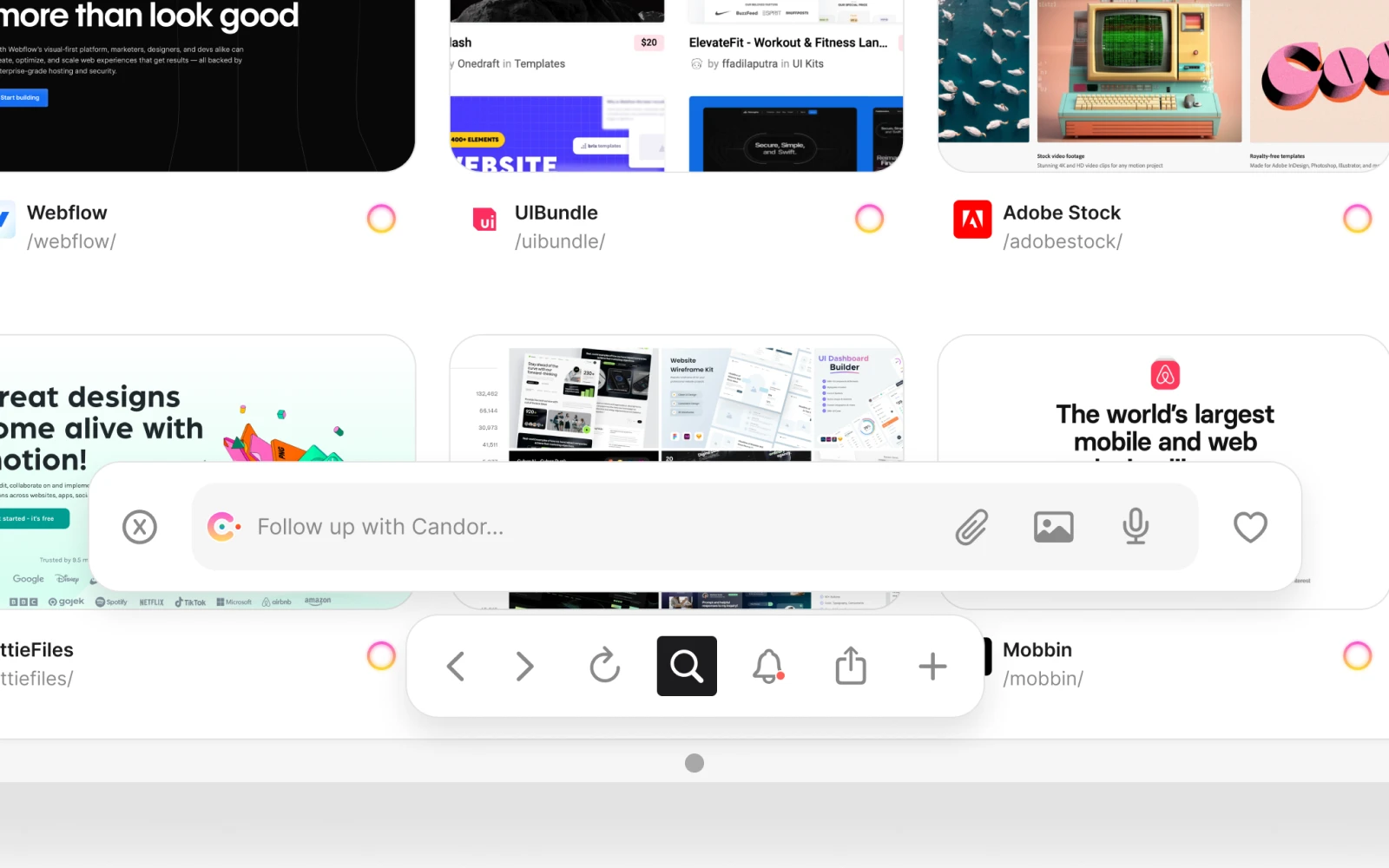
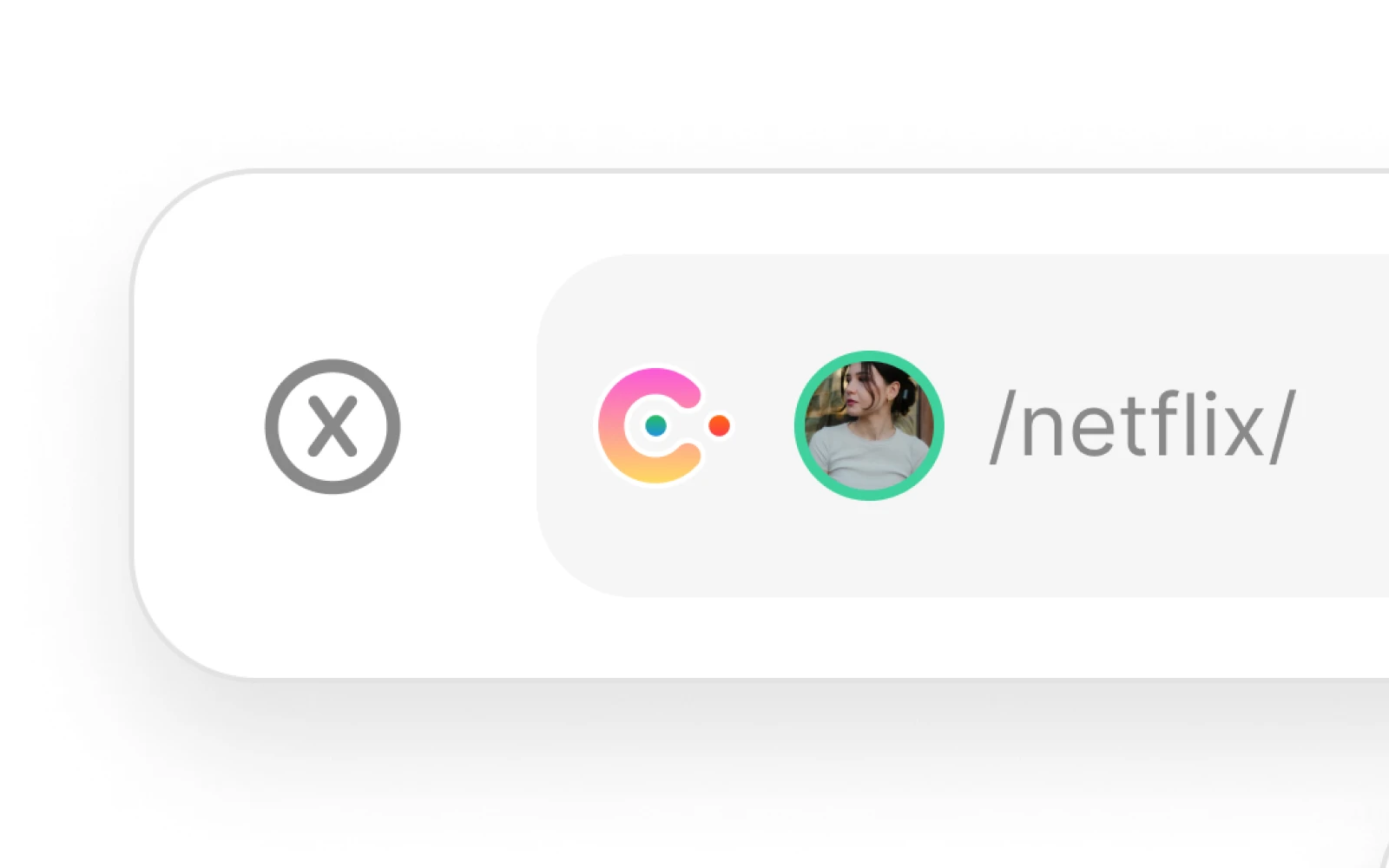
In most traditional browsers, users are forced to rely on bookmarks, search histories, or long, manual searches to locate the information they need. This approach often leads to inefficiencies, as users must remember where they saved content or navigate through cluttered interfaces to find their desired results. To address these pain points, the ‘/’ search functionality was introduced as a smarter, more streamlined alternative. Unlike standard browsers, this approach allows users to input targeted commands or keywords, instantly surfacing relevant results without the need for endless scrolling or guesswork.
The goal was to integrate an intelligent search logic that not only redefines how users interact with content but also ensures a faster, more intuitive, and frustration-free browsing experience.

For specific site search: you simply type into the search/prompt bar "/" followed by the name of the site and then followed by another "/". The user could type anything close to the name of the site and the user will get suggested results (just as traditional browsers) to help narrow down what the user intends.
For site dashboards: you simply type into the search/prompt bar "/" followed by the name of the site. Again, the user could type anything close to the name of the site and the user will get suggested results (just as traditional browsers) to help narrow down what the user intends. Users can access the official site through the dashboard as well.
I wanted users to have the ability to converse naturally with the assistant. To think critically about the way in which they browse the web as well as be more aware to what they are digesting from it. Through natural conversation users gain a more intuitive way to find exactly what they need.
We don't always know what we are looking for on the web. Within Candor, users can articulate their intent (no matter how vague), allowing the system to contextually search their past browsing history, and other relevant sources, and deliver to the user results that are precise or precisely vague but honed in the direction of what the user may want.
The goal was to have users converse naturally with the AI assistant in a way that sparks critical thinking. The assistant will suggest articles, videos, platforms, etc, in which the user may never see otherwise. Through natural conversation the user can ask the assistant questions about what they are currently viewing, and even follow up questions as to why the assistant felt it necessary to show them such results.


I thought it only natural to have the assistant actively identify and mitigate echo chambers. When it notices repetitive reliance on specific sources that may skew towards opinion-based content, the assistant steps in to suggest a broader range of credible and diverse resources. For instance, as shown in this interaction below, the assistant detects the user’s frequent visits to a single news source, highlights potential biases, and offers alternatives to ensure access to balanced, fact-based reporting. This proactive feature empowers users to break out of echo chambers, fostering a more open and informed browsing experience while promoting critical thinking and exposure to diverse perspectives.
The goal was to show how an assistant can aid a user while browsing the web while also not interrupting a users experience to things such as echo chambers, filter bubbles, and confirmation bias.


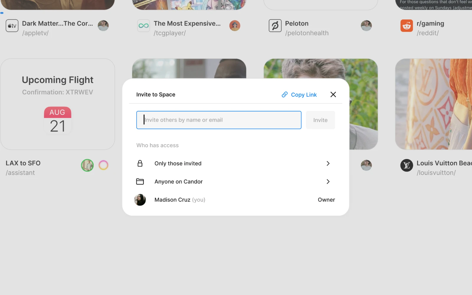
I wanted Candor to have a collaborative aspect to it. I drew from collaborative tools such as Figma, Framer, CodeSandbox, Sketch, and Google Docs. Candor’s Adding Friends to Spaces feature enables seamless collaboration and sharing by allowing users to invite friends and family to specific spaces for browsing together. These spaces act as dynamic environments where participants can share information, co-view content, and collaborate in real time.
The goal was to streamline collaboration, enhance information sharing, and create a more organized and interactive browsing experience with those who matter most.


Who doesn't love personalization at this level. I wanted users to be able to assign distinct themes to individual spaces, to enhance both organization and usability as well as develop a clear mental model between the many spaces they may create. Users can tailor a space with the help of the assistant for any specific purpose—whether for work, school, or whatever their heart desires—making it easier to visually distinguish between them at a glance.
The goal was to allow the user to be part of a creative process. When users create something, whatever it may be, they feel more connected to it. I wanted that feeling to be apparent in Candor.

Collaboration within Spaces + CursorChat
I envisioned users sharing sessions while in the same 'space' to engage in real-time conversations with each other as well as with the assistant. Whether it is planning a vacation, helping with school work, building a digital product, or simply watching a show together (as in the example below).
The goal was to allow multiple users to share a space, their space, on the web. Their space would be shared content in which anyone in the space has viewed, or is currently viewing in real-time. Spaces would have admins and reserve the right to admit or deny access to anyone to that specific space. All users can converse with the assistant as a collective group while in the space as well.


Conclusion
These are just the highlights though. If you would like to discuss more lets chat!
As a result I learned a lot about the browser space. I spearheaded the entire design process, from research and ideation to prototyping and final presentation. As I concluded this project, I was excited to witness the launch of SearchGPT—a recent AI advancement in browsing the web in real-time or, to simplify, a hybrid browser. The alignment of my work, which focuses on just that with the addition of generated dashboards infused with widgets that help capture the story of what a particular website may mean to a user, underscores how closely my research is intertwined with the evolution of AI-driven innovations. This is inspiring and a testament to the significant impact my project can have on the current AI landscape.
I was able to present this project to my cohort, HCI leadership at ArtCenter, as well as other guest attendees from UX leadership positions in the tech industry from companies like Google, Amazon, Microsoft, Tesla, and many more. Their feedback was invaluable and when I have time I work on iterations to this work as I love thinking in this capacity. This project was also featured on ArtCenter Graduate site as well.