


Role
MHCI Student
Credits
Julian Scaff (ArtCenter Chair)
Vincent Brathwaite (CEO & Co-founder @ /'Gidens/)
Timeline
Mar 1 - Apr 1, 2024
This was a graduate project at ArtCenter for my Masters in Human Computer Interaction (MHCI) class Product, Services, and Systems class.
This is not the full case study. For the full case study I would be happy to chat!
I designed and ideated every element, flow, prototype, and feature of GemCar Infotainment.
The objective of the Gem Car Infotainment System project was to design an intuitive, user-friendly interface that seamlessly translated manual, in-vehicle tasks into efficient digital experiences. This first iteration aimed to define the foundation of Gem Car’s infotainment system, incorporating their brand identity into the interface while ensuring functionality and ease of use. The project involved conceptualizing the overall structure, designing user flows, and prototyping interactive elements to deliver a cohesive solution for developers. The result was a thoughtfully crafted system that streamlined in-vehicle interactions and set the stage for future iterations of Gem Car’s digital ecosystem.

Challenges
“How might we” questions are a powerful tool in the design thinking process, serving several key functions that help teams build a successful digital product experience. We utilized them to transform our challenges into stepping stones, driving innovation and aligning team efforts around creating a user-centric product experience.
• How might we make the infotainment system intuitive and easy to use for short trips?
• How might we provide valuable location-based information relevant to short-distance driving?
• How might we seamlessly integrate smartphone connectivity without overwhelming the user?
• How might we design a clear, uncluttered interface that’s still visually appealing in a compact cockpit?
• How might we use data from the car’s sensors to enhance the user experience in meaningful ways?
• How might we create an infotainment system that adapts to changing conditions (weather, lighting, traffic)?
Through physical prototyping and card sorting exercises, I formulated the IA. Placing alike controls that were grouped with the following attributes in mind: task prioritization and hierarchy, glanceability and visual clarity, consistency and familiarity, driver distraction, context-awareness, feedback and affordances, accessibility and inclusivity, safety and regulatory considerations, and scaleability for future updates.
The goal was to build a system in which remained user-friendly, efficient, and safe for drivers who need quick, reliable access to key features on the move.
I built the design system utilizing color tokens, variants, and modes in Figma to accommodate for light and dark modes.
The goal was to have optimal readability, reduce eye strain, and enhance safety under varying ambient light conditions and have them controlled in relation to the time of day.


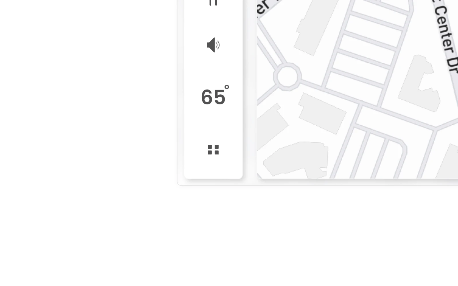
The vehicle basic cluster is high priority features for the user to understand at all times. Located in the top left corner of the screen it has the best access both visually and physically for a driver to glance at while driving. It houses the speedometer, lock/unlock, as well as both settings and navigation access points.

Collapsable Sidebar Cluster
I aimed to minimize distractions and reduce cognitive load by designing a collapsible sidebar that efficiently uses screen space. This feature provides essential driving information in a clear, unobtrusive manner—delivering key vehicle data and safety details when needed while keeping the display uncluttered. The sidebar can be expanded for a deeper view or collapsed to prioritize a clean interface, ensuring that drivers receive critical information without compromising their focus on the road.


I had to think through what each state this sidebar would display when in each drive state: drive, park, neutral, and reverse, as well as how it would adapt to tasks (e.g. charging, vehicle in motion, and more) while in each state.


The sidebar incorporates an overhead vehicle status indicator, offering users a comprehensive, at-a-glance view of their vehicle’s condition. It dynamically presents key details tailored to various driving and charging scenarios, ensuring that essential information is always within reach.


User Statuses Cluster
I designed a dedicated cluster tailored to the driver’s environment. This “User Statuses” cluster consolidates critical information—including the current driver profile, Bluetooth and Wi-Fi connectivity, external temperature, time, and voice control features—ensuring that essential data is easily accessible and contextually relevant.
Upon tapping the driver name a panel reveals other drivers assigned to this particular vehicle.

Map States
Research shows that drivers perform best when maps mirror their mental models—essentially, when the map’s presentation reflects the actions they take within the interface. This adaptive design means that the map changes its display based on user activity. For example, while driving, it offers a perspective that closely aligns with the driver’s viewpoint, and when parked, it shifts to present an intuitive, context-aware view. By thoroughly researching every potential interaction a user might have with the map, I was able to develop map interfaces that seamlessly correspond to these mental models, enhancing usability and driver confidence.
I built a custom Mapbox CSS style for use in both light and dark mode for GemCar.
There were three factors that I found that contributed to map interactivity:
• Route is active or inactive.
• Speed is active or inactive.
• Drive state selection. (Drive, Reverse, Neutral, and Parked).


Finding Chargers
I created this interface to help drivers quickly locate and evaluate nearby charging stations, showing details such as distance and availability at a glance. By seamlessly integrating station information into the map, users can effortlessly plan their charging stops and maintain confidence in their travel plans.


I incorporated the option for users to display their own images during the infotainment system’s inactive states to foster a sense of personalization and emotional connection. By allowing drivers to feature their favorite photos—such as family moments, scenic landscapes, or personal milestones—the interface transcends mere functionality and becomes a more meaningful, user-centric space. This approach not only makes the driving environment more welcoming but also can subtly enhance the driver’s mood and overall satisfaction by surrounding them with images that resonate on a personal level.


I integrated a 3D visualization of the Gemcar dashboard into the infotainment system’s climate controls to give drivers a clearer, more intuitive understanding of their vehicle’s interior environment. By recreating the dashboard in Blender, the interface provides a tangible reference for how vents, temperature zones, and other controls are laid out in the physical cabin. This not only adds a modern, engaging aesthetic but also helps users quickly locate and adjust settings with confidence, ultimately enhancing the overall driving and user experience.


Vehicle Settings
I wanted to follow the same pattern used for the climate controls to keep the users mental model consistent in that manner for accessing 'controls' in general. I utilized a bottomsheet to access the vehicle settings to have users quickly access a variety of aspects pertinent to controlling their vehicle details.


Camera
I developed the camera interface to support GemCar’s reverse and side mirror camera functionalities. When activated, it launches a context-aware bottomsheet that aligns with the driver’s mental model, ensuring an intuitive and seamless user experience.


Charging
As GemCar is an electric low speed vehicle it needed a simple but effective charging flow. After looking at various other EV charging flows, and utilizing research I had conducted at a number of Tesla charging stations I gravitated towards the following flow. I designed the charging flow to provide a clear, real-time snapshot of the battery’s status and remaining range, allowing drivers to quickly gauge their vehicle’s readiness. Additionally, interactive elements—such as charge port locks and adjustable charge limits—offer straightforward controls that align with a driver’s natural mental model, enhancing both usability and peace of mind.


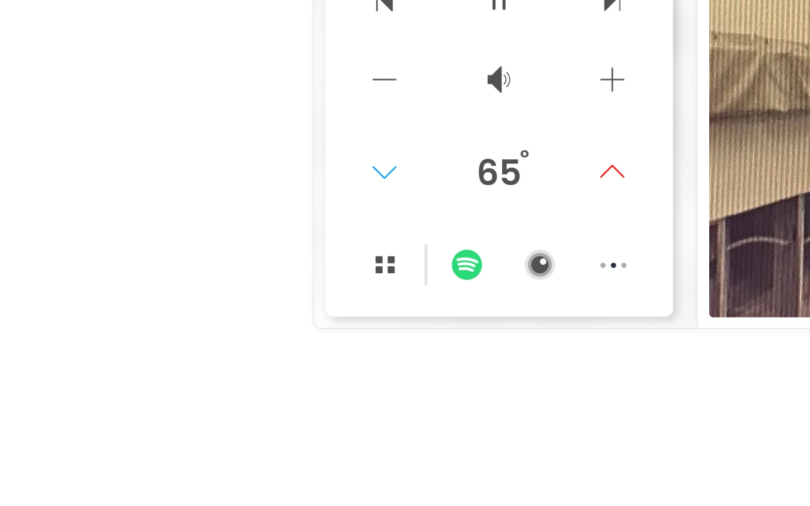
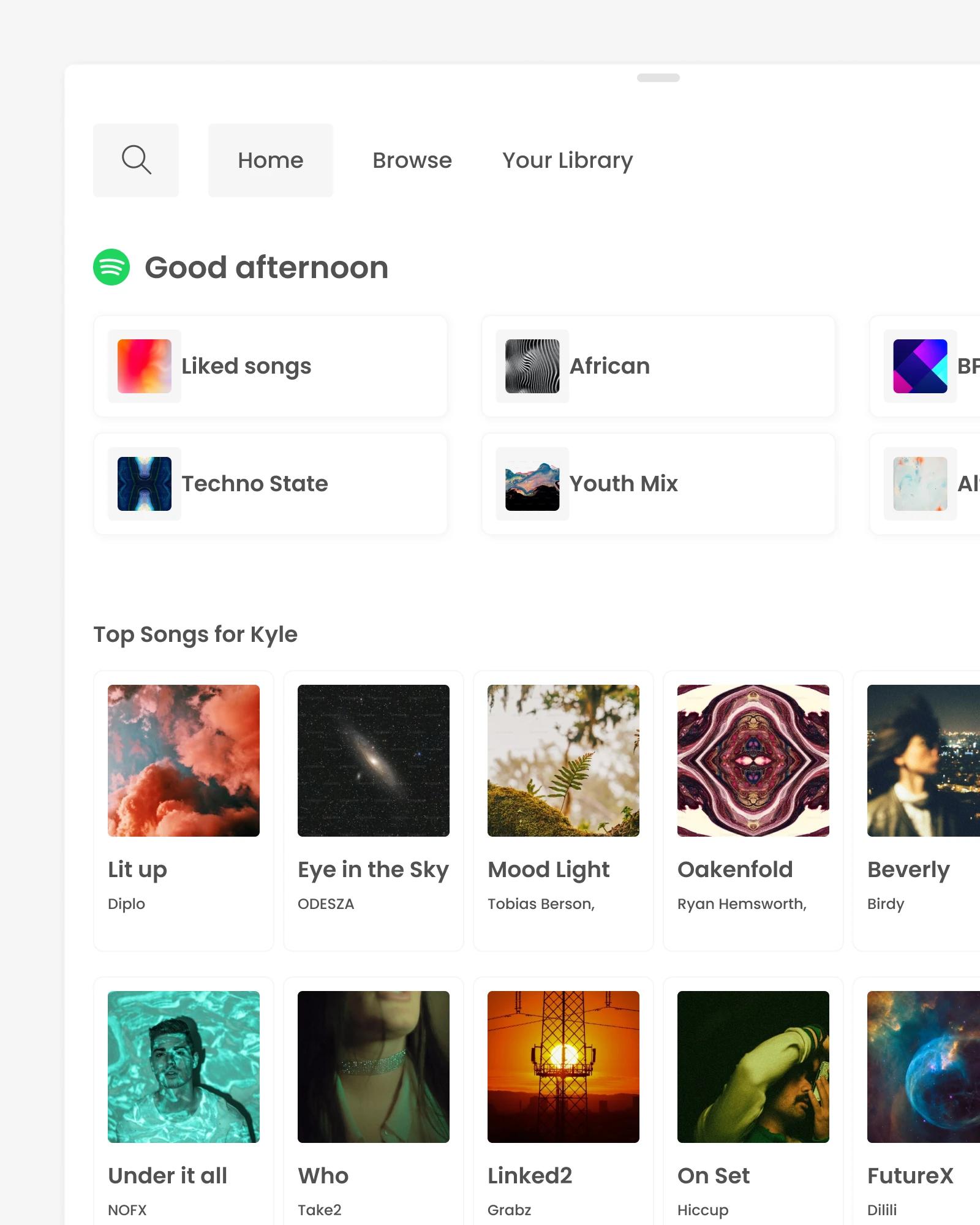
Music & Entertainment
What is infotainment without entertainment. I introduced a bottom sheet for music selection to create a familiar, mobile-inspired interaction that reduces cognitive load and streamlines access to content. By occupying only the lower portion of the screen, this design preserves visibility of critical driving information while allowing users to easily browse and control their music with minimal distraction.


Software Updates
I designed the software update flow to clearly communicate each step of the process—highlighting real-time progress, estimated completion times, and options for scheduling. By offering concise, intuitive prompts and visuals, the system minimizes driver uncertainty, streamlines decision-making, and ensures updates can be performed with minimal disruption to the user’s routine.


Conclusion
These are just the highlights though. If you would like to discuss more let's chat!
As a result I learned a lot about designing within the automotive space. The physical prototyping aspect of this product brought in new challenges that made the project just that much more interesting. Thinking through driver safety, and accessibility, as well as designing for a 3D space in which was set to spec was super fun.
I presented this work to my classmates, various professors, and design leadership while at ArtCenter.